Industry
Manufacturing (Consumer Electronics and Home Appliances)
Client Overview
Vivax is a leading Croatian company specializing in consumer electronics and home appliances, with a significant market presence in Croatia and Southeastern Europe.
Project Type
UI / UX
Methodologies used
Methodologies used
~ Analysis of Existing Web Page
~ Competitive Analysis
~ Usability Testing
~ User Journey Mapping
Project goal & brand's identity
Analysis of the Existing Web Page
The initial phase involved a detailed analysis of the current Vivax website to identify areas for improvement. This analysis was instrumental in understanding the existing site, rather than being the sole factor for changes, which were informed by user research. I collaborated closely with developers to ensure project goals were aligned and implementation was seamless.
Thorough Examination
Reviewed each webpage to identify inconsistencies, usability issues, and areas needing visual and functional enhancements.
Strategic Recommendations
Provided suggestions for changes and strategic directions by annotating webpage screenshots.
Detailed Inventory
Compiled a comprehensive list of all web pages and documented potential states for each element, crucial for dynamic components like product pages. The redesign ultimately covered 16 distinct pages plus product pages.
This systematic analysis laid the groundwork for the redesign, providing a clear roadmap for improvements and guiding on where to start focusing for user testing and further research.
USABILITY TESTING &
USER JOURNEY MAPPINg
USER JOURNEY MAPPINg
Objective
To visualize user paths, identify pain points, and gather feedback for enhancing the user experience.
Participants
Four individuals aged 30-50, selected based on Vivax based target customer demographic.
Task
Participants were given this scenario:
"Summer is approaching, and you need a new air conditioner (AC) for your holiday home. You are considering Vivax and other options within a modest budget. Explore the Vivax website and other sites if necessary, and choose the ideal AC for your holiday home."
"Summer is approaching, and you need a new air conditioner (AC) for your holiday home. You are considering Vivax and other options within a modest budget. Explore the Vivax website and other sites if necessary, and choose the ideal AC for your holiday home."
Participants navigated the website, provided commentary on their actions, and explained their final decisions. User journey maps were then created based on the findings to highlight specific pain points.
Key Findings
- Preference for less technical, more user-friendly product descriptions, with targeted marketing language like "perfect for holiday rentals."
- A desire for price information, despite Vivax not being a direct seller (this was therefore not possible)
- The inability to clearly find instructions on where to buy the product
- The product comparison feature on the Vivax site was highly valued
- Real-life photos influenced participants' decisions, especially considering interior design aspects.
Competitive analysis
To address issues identified during usability testing, I conducted a competitive analysis to understand different approaches in the same industry. The analysis covered seven of Vivax's major competitors: Maxon, Korel, Hyundai Klima, TCL, Gorenje, Hisense, and Electrolux.
PROPOSED DESIGN CHANGES
Advice on less tehnical text and 'more user-friendly product descriptions'
Previous design
Redesign
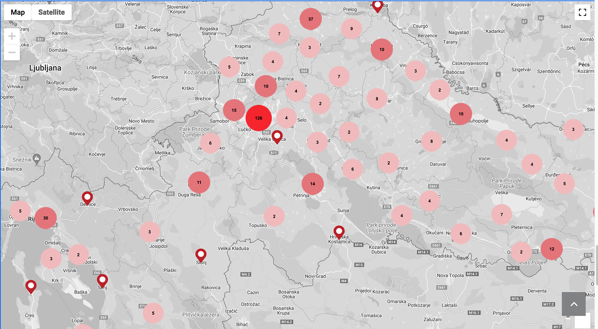
Interactive Maps
'Inability to clearly find instructions on where to buy the product' & 'desire for price information' - added information about the place to buy products and (if applicable) the resellers contact.
Visualising text-heavy blocks
The existing website was overly text-heavy. To improve this, I replaced the most common descriptive elements with graphics. Additionally, more 'real-life scenario photos' were introduced to enhance visual appeal. For a cleaner look and a single point of focus, photos were used without overlaying text or graphics, provided that the accompanying text was placed in the same row.
Previous design
Redesgin
Brand identity elements
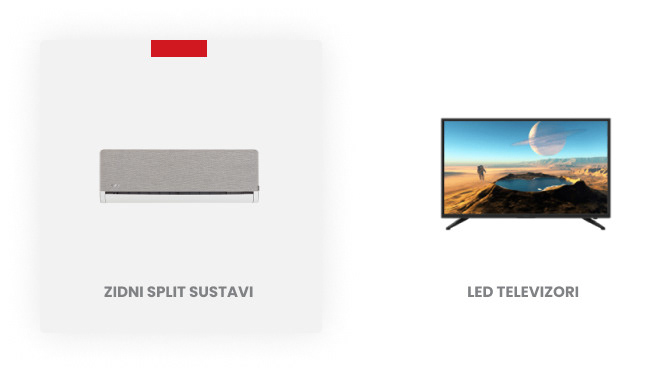
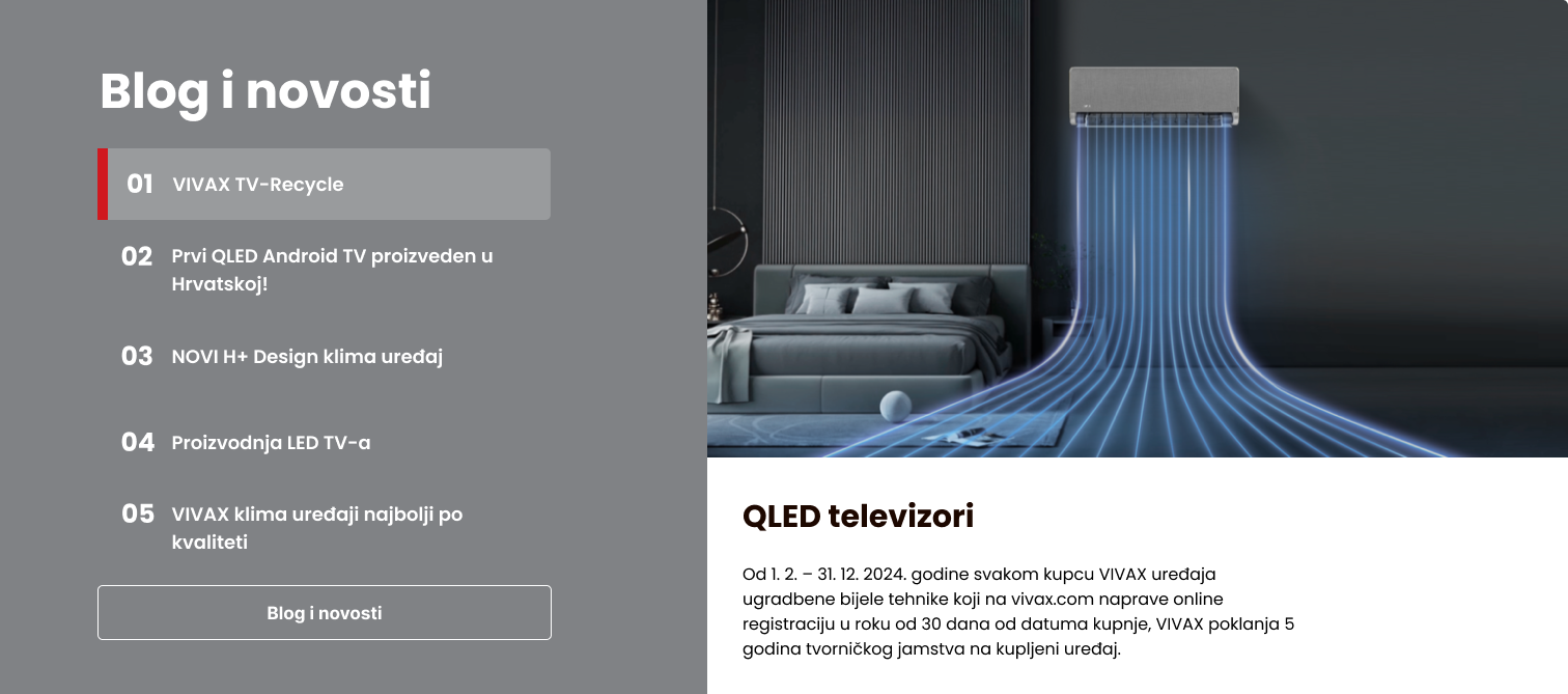
In addition to usability, I focused on enhancing brand memorability by incorporating red and gray elements across various module states. The red square element, inspired by a previous social media marketing campaign (made by Vivax team), was integrated to reinforce brand identity.

Product type navigation; hover state

'Where to buy' map

Article banner; hover state

AC types navigation; hover state

Blog and news; hover state
Navigation Menu Enhancement
Improved the navigation menu by adding essential informative sections such as FAQ, Guarantee Insurance, Service Repair Points, 'Where to Buy', and Contact. This enhancement aimed to improve user access to key information.
Comparison of previous and new design for main menu navigation
Company Information
Created a new page dedicated to enhancing trust, transparency, and establishing a positive brand image. This included adding impactful numbers and key characteristics about the company.
Hover States on Product Images
Implemented dynamic hover states on product images to create a more engaging user experience. This feature, inspired by successful competitor pages and positively received by users, enhances the ability to visualize products in real-world scenarios.
LOOKBACK
Through rigorous analysis, user-centered design principles, and strategic enhancements, the redesign of the Vivax website aimed to achieve a seamless user experience while reinforcing the brand's identity and values.
Key improvements included optimizing visual content with graphics and real-life photos, enhancing navigation with essential informative sections, and implementing dynamic features like product image hover states. The redesign not only addressed usability issues identified through testing but also elevated the brand's memorability and transparency with dedicated informational pages. By incorporating insights from competitive analysis and user feedback, the redesigned website now offers a more intuitive interface and engaging user interactions, setting a new standard in user experience for Vivax's online presence.
Key improvements included optimizing visual content with graphics and real-life photos, enhancing navigation with essential informative sections, and implementing dynamic features like product image hover states. The redesign not only addressed usability issues identified through testing but also elevated the brand's memorability and transparency with dedicated informational pages. By incorporating insights from competitive analysis and user feedback, the redesigned website now offers a more intuitive interface and engaging user interactions, setting a new standard in user experience for Vivax's online presence.